PassePartout
PERFORMERS PRACTICE

Title: PassePartout
SECTION: PERFORMERS PRACTICE
Design & study: Ali Taifour
Production: White Hole Studio
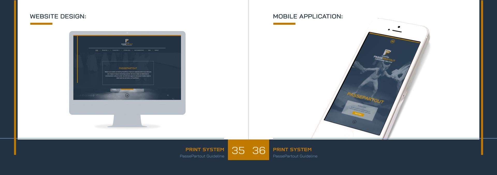
Type: Logo, visual identity & Website
Date and location: Utrecht, 28-08-2024
PassePartout
PERFORMERS PRACTICE
Established in 1987, PassePartout is a Dutch organization fostering international exchange in performing arts. It provides professional theater makers opportunities for training and creative development. Over 150 global events, including workshops and festivals, have enriched the community. In the 1990s, PassePartout held masterclasses at Utrecht Academy, focusing on communication skills. Today, the organization emphasizes storytelling, contributing to middle school curricula and engaging in projects with former refugees. Notable workshops between 1991-2006 featured renowned artists covering various disciplines, enriching the global performing arts scene.
Today, PassePartout remains a luminous beacon, a custodian of storytelling, guiding performers through the timeless realms of creativity.
Logo Elements
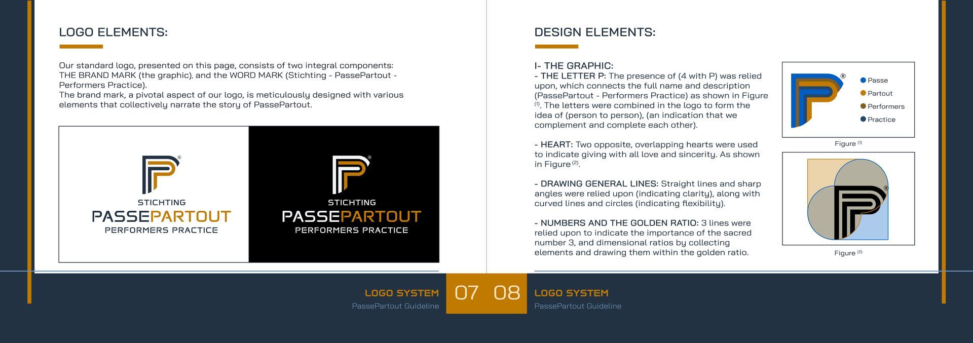
The standard logo, consists of two integral components:
the brand mark (the graphic), and the word mark (Stichting - PassePartout - Performers Practice).
The brand mark, a pivotal aspect of the logo, is meticulously designed with various elements that collectively narrate the story of PassePartout.

Design elements
I- The graphic:
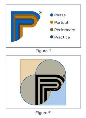
- The letter P: The presence of (4 with P) was relied upon, which connects the full name and description (PassePartout - Performers Practice) as shown in Figure (1). The letters were combined in the logo to form the idea of (person to person), (an indication that we complement and complete each other).
- Heart: Two opposite, overlapping hearts were used to indicate giving with all love and sincerity. As shown in Figure (2).
- Drawing general lines: Straight lines and sharp angles were relied upon (indicating clarity), along with curved lines and circles (indicating flexibility).
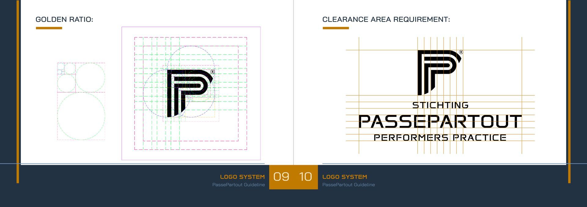
- Numbers and the golden ratio: 3 lines were relied upon to indicate the importance of the sacred number 3, and dimensional ratios by collecting elements and drawing them within the golden ratio.
brand user guide
``Thank you so much, Emile, for your kind words and thoughtful feedback! It was a pleasure working with you and bringing your vision to life through the website. I'm thrilled to hear that you were satisfied with the process and the final result. Your trust and collaboration were key to making this project a success. Looking forward to future opportunities to work together again!``


